Construction Site Signs: Sizes, Placement, and Care
It's pour morning. The mixer is queued, the pump is set, the flagger is already in the lane, and the crew is watching the chute operator for the first signal.
That's exactly when a board left over from last week, a panel nobody can read at speed, or an arrow pointing to a washout that moved yesterday does its damage. construction site signs don't fail because you forgot to buy them. They fail because the hazard moved and the message didn't.
Why Construction Site Signs Fail First
Say the lane closure shifted overnight. Last week's orange board is still square to traffic, clean, and easy to read. Today's advance warning sits behind a delivery truck at an angle.
Drivers will follow the sign they can read. It doesn't matter that the other one is correct. From a moving cab, legible and wrong beats correct and hidden every time.
That's the pattern behind most sign failures. The board is too small for the approach speed. A pump, a stockpile, or a parked pickup cuts the sightline. Or the work moved on and the sign stayed behind, still telling people to watch for a hazard that's no longer there.
The Stakes Are Not Theoretical
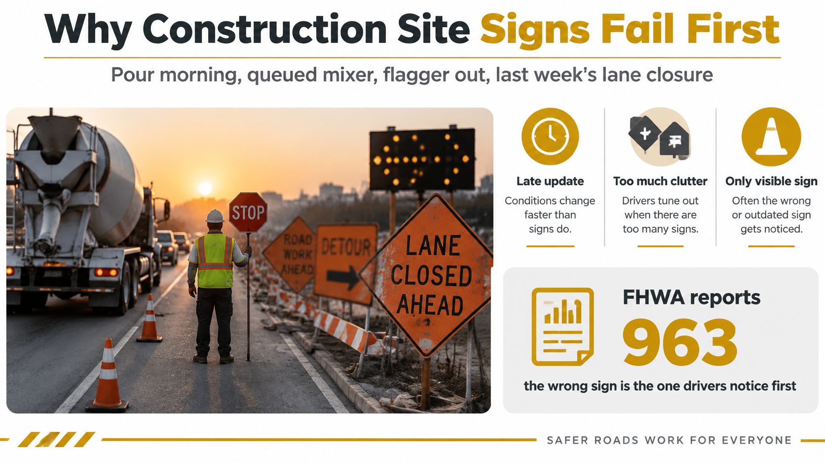
The Federal Highway Administration work-zone facts and statistics report 963 total work-zone fatalities in 2021 and 891 in 2022, with 899 people killed in work-zone crashes in 2023, a decline of nearly 7% from 2021 through 2023. Highway-worker occupational fatalities at road-construction sites totaled 108 in 2021 and 94 in 2022.
Those numbers include motorists and other road users, not just workers. FHWA also states that one work-zone fatality occurred for every 4 billion vehicle-miles traveled and for every $112 million in roadway-construction expenditures.
That mix is the point. Your signs aren't only talking to your crew. They're talking to a driver who doesn't know your site, can't see past the truck ahead, and has seconds to slow, shift, or stop.
Signs Are Controls, Not Branding
Treat construction site signs the way you treat a barricade or a spotter. Their job is to separate people from trucks and equipment and to tell everyone approaching what to do before they reach the hazard.
The regulatory home is OSHA 29 CFR 1926 Subpart G, which covers signs, signals, and barricades, including accident-prevention signs and tags, signaling, and barricades. For highway work zones, that points you to the Manual on Uniform Traffic Control Devices, the MUTCD. You don't need a legal lecture to use it. You need the right signal word and color, letters sized for the approach, wording a mixed crew can act on at a glance, and a shift audit that pulls boards when the hazard moves.
A leftover sign can be as dangerous as a missing one, because it trains drivers and crews to ignore the next real warning.
Sign Colors Sizes and Sample Wording
Don't start by shopping for panels. Start by ranking the hazard, then let the table do the lookup work for you.
How to Use the Table
- Rank the hazard first. DANGER is for a hazard that will cause death or serious injury. WARNING is for one that could. CAUTION covers minor or moderate injury. NOTICE is for a site rule that isn't a hazard.
- Match the color to the signal word. Red goes with Danger, orange with Warning, yellow with Caution, blue with Notice, and green with first aid, eyewash, and exit routes. Drivers and crews read color before they read words, so a mismatch slows the response.
- Take the minimum size from the row. Then check it against your real approach distance before you order or print anything. A panel that's compliant on paper and too small for the road is just a well-made mistake.
- Cut the sample line down to one idea. One panel, one instruction. If you need a second sentence to explain the first, the panel is trying to do two jobs.
- Use the traffic rows for flagger work. Work-zone warning and the Stop/Slow paddle have their own rules, and they override whatever general site board you were about to hang.
| Sign | Color and sheeting | Minimum size | Use when | Sample wording |
|---|---|---|---|---|
| Danger | Red background, white letters | Large enough for the approach; 1 inch per 30 feet | A hazard that will cause death or serious injury | DANGER Open Shaft |
| Warning | Orange background | 1 inch of letter height per 30 feet of legibility | A hazard that could cause death or serious injury | WARNING Overhead Load |
| Caution | Yellow background | 1 inch of letter height per 30 feet of legibility | Minor or moderate injury is possible | CAUTION Wet Concrete |
| Notice | Blue background | Readable at a walking approach | A non-hazard site rule | NOTICE Authorized Personnel Only |
| Safety instruction | Green background | Readable at a walking approach | First aid, eyewash, or exit route | FIRST AID |
| Work-zone warning | Fluorescent orange, retroreflective | Action words at least 8 inches on portable signs | Drivers must slow, shift, or detour | ROAD WORK AHEAD |
| Stop/Slow paddle | Octagonal, retroreflective | Paddle at least 18 inches wide; letters at least 6 inches | A flagger is controlling traffic | STOP / SLOW |
| Restricted or barricade | Red-and-white or orange-and-white per MUTCD | Message panel uses the 1-inch-per-30-feet rule | Entry to slurry, a shaft, or equipment must stop | KEEP OUT Washout |
Where the Sizes Come From
These aren't house styles. The OSHA highway work-zone standards summary describes how, in 2002, OSHA finalized rules incorporating later MUTCD editions for federal-aid highway construction, and how "Stop/Slow" paddles replaced flags as the primary device, with an octagonal paddle at least 18 inches wide and lettering at least 6 inches high.
That history matters on a buying decision. A flag in a flagger's hand looks like guidance. A paddle with 6-inch letters reads as an instruction at distance, and that's why it won.
Material and Mounting Choices
For a ground-mounted work-zone board where legibility is the limit, I would choose fluorescent orange retroreflective sheeting over beaded high-intensity orange. It costs more, but you're buying reading distance, and reading distance is reaction time.
For zones that'll last longer than one shift, set signs on fixed posts at the specified mounting height instead of leaning them on barricades and hoping the wind cooperates. Keep every night-facing panel retroreflective. A sign that reads fine at noon and disappears under headlights isn't finished.
Match a row before you print a custom board. When no row fits your hazard, build the wording from the nearest signal word and keep its color. Don't invent a new category because the marketing department likes a different palette.
How to Place Signs Drivers Can Read
Placement is a sequence, not a spot that looks empty. Work it in order and you'll catch most failures before a driver does.
Five Moves in Order
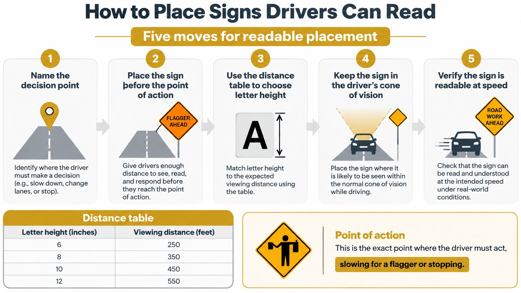
- Name the decision. Write down the exact action and the point where it has to happen. Slowing for a flagger is a different placement problem than stopping short of a washout or merging before a lane ends.
- Set the approach distance. Start from operating speed and the time a driver needs to read, decide, and stop or shift. Then pick the letter height from the distance table below. Don't pick the panel first and hope the distance works out.
- Choose sheeting for the worst hour, not the best. Use retroreflective or fluorescent materials suited to both daylight and nighttime. When a ground-mounted sign needs more legibility than beaded high-intensity orange can give you, go fluorescent orange.
- Walk, or drive, the approach yourself. Confirm the face is conspicuous, unobstructed, and says one thing. Check it from the lane the driver is in, at driver eye height, not standing next to the post.
- Fix the mount and add redundancy where the sightline is short. Longer-duration zones belong on fixed posts. Where a curve, crest, or parked equipment shortens the view, a second advance sign isn't clutter. It's the control.
Pick the Letter Height From the Distance
The FHWA handbook chapter on signing for the aging population recommends at least 1 inch of letter height for every 30 feet of required legibility distance and fluorescent orange over beaded high-intensity orange sheeting when greater ground-mounted sign legibility is needed, with action words on portable signs generally at least 8 inches high. Field-review data in that chapter show construction-sign legibility ranging from 198 m (650 ft) for the best observers to only 43 m (140 ft) for the worst observers.
| Letter height | Legibility distance | Panel example |
|---|---|---|
| 1 inch | 30 feet | Minimum for any legibility distance |
| 5 inches | 150 feet | Gate or plant approach warning |
| 8 inches | 240 feet | Portable action words such as ROAD WORK AHEAD |
That spread between 650 feet and 140 feet is the whole argument. The person who hung the board is young enough, close enough, and already knows what it says. The driver you're designing for might be older, driving at night, in rain, behind a box truck.
Design rule: Size and place the sign for the worst reasonable observer, not for the crew member who installed it.
The Same-Day Test
Before work starts, drive the approach at operating speed. If you can't read the message, understand it, and act before the hazard, the sign is in the wrong place or the letters are too small.
Move the sign. Don't add a paragraph underneath it. Extra words at speed don't add clarity, they add reading time you don't have.
Wording Mixed Crews Can Act On
A color code tells a worker how serious something is. It doesn't tell him what to do in the two seconds he has, with a pump running beside him and dust on his glasses.
That's the gap most sign lists ignore. They explain what DANGER, WARNING, and CAUTION panels should look like, and stop before asking whether the person walking past can act on the message.
Language Ability Beats Experience
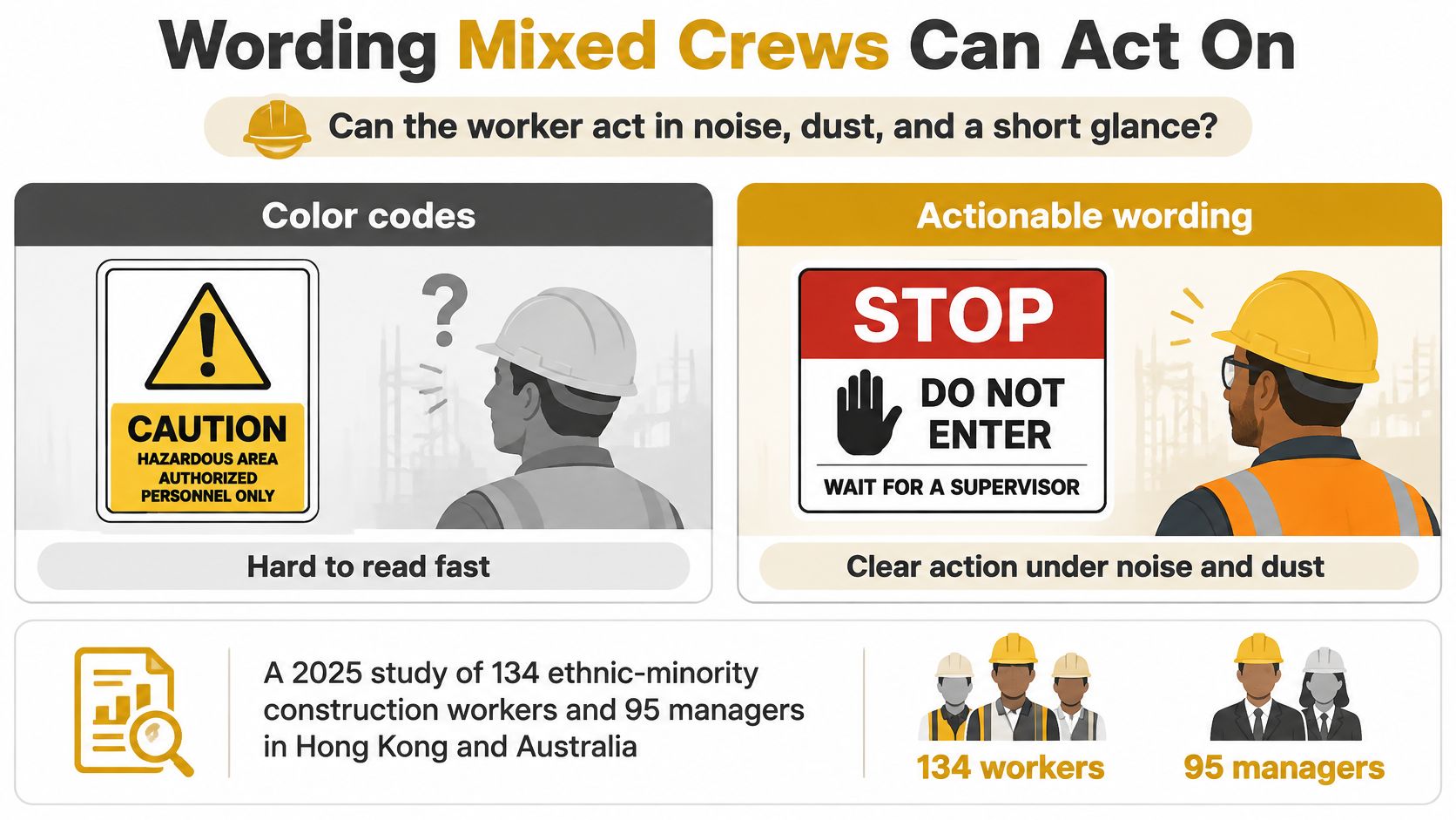
A 2025 peer-reviewed study indexed on PubMed of 134 ethnic-minority construction workers and 95 managers in Hong Kong and Australia found that workers' language ability was the most important factor affecting effective safety communication, ahead of construction experience and personal characteristics.
Read that plainly. A veteran finisher who can't read your panel is less protected than a new hire who can. Experience doesn't decode text.
Three Treatments, Judged by Whether a Walker Can Act
Symbol alone wins for universal actions. Stop, no entry, slippery surface, high voltage, and eye protection all have pictograms a worker can read without a shared language. At a glance, in noise, symbols are fastest. Their weakness is specificity: a symbol says keep out, not why or what's allowed instead.
An English sentence works for people who already know the site. Supervisors, inspectors, and returning subs can handle a fuller instruction at a gate board. It fails as a field control for a mixed crew because it assumes reading fluency, standing still, and time, none of which a worker crossing a deck with a load has.
A bilingual line plus a symbol helps, within limits. For one specific rule and a crew that speaks those two languages, it's a good panel. It breaks down when the crew speaks three or four languages, or when squeezing two languages onto one board shrinks the type below what anyone can read while walking. Two unreadable languages aren't better than one.
The Washout Panel as a Worked Example
A washout sign is where dense text goes to die. The accepted materials list for a pan can run to concrete and cementitious material, plaster, grout, asphalt, stucco, pump washout ready mix, washout shotcrete rebound, and rubble mortar. Print that on a panel and nobody will read past the second item.
The panel needs the rule, not the catalog. Use a slurry pictogram, the words KEEP OUT, and at most three allowed materials if the crew needs them to sort loads. Everything else belongs in the toolbox talk.
Pair any new board with that talk on the day it goes up. Where phones are allowed on site, add a QR code linking to the same instruction in the languages on that crew, not a generic page in twelve languages nobody asked for.
Then run the check. One idea per panel. Symbol or signal word first. Letters sized for the walking distance from the path, not from arm's length at the sign shop. And because crews change between phases, re-check the languages on every new board when the trades rotate, not just when the sign goes up.
If a worker has to stop, squint, and translate, the sign has already failed. He's standing in the hazard while he reads about it.
Audit Signs When the Work Moves
More signs can make a site less clear. That's the assumption worth challenging, because every obsolete or contradictory board you leave standing is competing with the live hazard for a driver's attention.
A driver approaching three orange panels, one current and two stale, doesn't read all three and reason it out. He reads the first legible one and discounts the rest. Your clutter just spent his attention for you.
The Removal Rule Is Part of the Standard
OSHA standard 1926.200 on accident-prevention signs and tags requires construction signs and symbols to remain visible while work is performed and to be removed or covered promptly when hazards no longer exist, along with legible traffic-control signs at hazard points and MUTCD-conforming devices for worker protection.
So removal isn't housekeeping. It's half the requirement. A board that was compliant on Monday can be the violation on Thursday if the hazard it describes is gone.
Six Checks at Shift Start and at Every Phase Change
Give the foreman a short list he can finish with his coffee in hand.
- The message is still true. The hazard exists, in that spot, today. If the pour moved, the panel moved.
- The sightline is clear. Nothing parked, stacked, or grown between the approach and the face since yesterday.
- The face is clean. Slurry, dust, and overspray come off. A dirty orange panel reads brown at distance.
- The sheeting still reads after dark. Check reflectance with headlights or a flashlight, not by memory from July.
- The mount isn't leaning. A tipped panel throws headlight reflection into the sky and reads as scrap, not instruction.
- A removal time is set. Somebody owns the hour this board comes down, the way somebody owns the pour.
On a pour, don't wait for a weekly walk. Access routes, truck paths, and the slurry location can all change before lunch. Audit at shift start, then again whenever the work area moves.
Match the Fix to the Finding
| What you find | Why it fails | What to do |
|---|---|---|
| Faded or dull orange | Night drivers lose the message | Replace it with fluorescent retroreflective sheeting |
| Dirty or tipped face | Legibility can fall toward 140 feet | Clean it, replumb it, and rewalk the approach |
| Blocked by trucks or a pump | The decision point has no sightline | Move the sign or add an advance board |
| Message from the last phase | It contradicts the live hazard | Cover or remove it before the shift starts |
| Wet-concrete sign after the slab is walkable | Crews start ignoring the next real caution | Pull it once the surface is safe to walk |
| Washout arrow and no pan | People treat an empty spot as restricted | Move the sign with the pan the same day |
Notice how few of those fixes are "put up another sign." Most are cleaning, moving, covering, or removing the one that's already there.
That's the contrarian point worth keeping. When an old sign is the problem, another sign is the wrong fix. It adds a second voice to an argument the driver has already stopped listening to.
Set Washout Signs Before the Next Pour
Turn the audit into a pre-pour routine and you stop improvising on the morning concrete arrives. The afternoon before is when this gets done, while there's still time to move a pan or reprint a panel.
The Four-Sign Walk
Have the foreman walk the approach and confirm four boards, in the order a truck and a crew member meet them.
- A traffic or plant-gate warning where mixers enter, sized for the approach speed at the gate, not for a pedestrian.
- Eye and PPE protection at the pour, placed where the crew picks up tools and steps to the deck, symbol first.
- A wet-concrete caution where the edge will be slick, on the walking path people will use, not the one on the site plan.
- A KEEP OUT washout sign with a symbol at the pan, readable from where the chute operator stands before the first rinse.
That last placement matters most. If the operator can't see the washout sign from the chute, he'll rinse where he's standing and read about the rule afterward.
Get the Pan on the Ground First
A sign that points at an empty spot teaches the crew to ignore it before the pour even starts. So the pan lands before pour day, and the sign goes up with the pan, not ahead of it.
We deliver by crane truck and the foreman directs pan placement, so the pan is on site before pour day and sits where the sign, the truck path, and the chute all agree. Book the pan for the same window as the pour and confirm the delivery time with us before the day, not from the cab of the first mixer.
Pull Boards as the Pour Ends
Take the wet-concrete caution down once the slab is walkable. Leaving it up teaches finishers that CAUTION panels are decoration, and that lesson transfers to the next deck.
Take the washout sign down when the pan is hauled off. A restricted zone that outlives its container is just an argument waiting for the next sub who needs that ground.
Your move before the next pour is small and specific. Walk those four locations. Correct any leftover board you find. Lock in the pan for the same window as the concrete, and put the washout sign where the chute operator sees it before water hits steel.
Before your next pour, line up containment the way you line up concrete, with a load-tested steel washout pan on the ground, signed, and scheduled off your pour window rather than a route. Reborn Rentals rents and services concrete washout pans with jobsite delivery and compliant haul-off, so your KEEP OUT sign is pointing at a real pan when the first chute rinses. Book your pan today at Reborn Rentals and confirm your delivery time before pour day.